
Automated genome assembly
A massive effort by the human pangenome reference consortium to automate diploid assembly

More is Different.
Introduction
One of the recurring themes of this newsletter is that genomics is going through an incredible acceleration. Over the last quarter of a century, DNA sequencing has decreased in cost far faster than even Moore’s Law. New sequencing technologies like Oxford Nanopore have made it possible to take analysis anywhere that a laptop can go. I actually don’t think that science fiction has predicted a genetic technology as cool as this.1

Oxford Nanopore and technologies like PacBio are examples of long-read DNA sequencing—where the fragments of DNA measured by the instrument are orders of magnitude longer than short-read technologies such as Illumina. This crucial difference in read lengths greatly decreases the complexity of sequence assembly—where reads are stitched together into a complete genome. Last year, a project called The Telomere-to-Telomere (T2T) consortium was formed to capitalize on this technological shift. They used long-read sequencing in combination with new assembly algorithms to create the most complete human reference genome that we’ve seen to date.
When I interviewed Karen Miga, who was one of the co-chairs of T2T, her vision of the future reminded me that we are still only scratching the surface of what is possible. It became clear to me that creating one complete reference genome was never the final finish line.
In ten years, people will look back at what the T2T consortium did, and also think “that's crazy!” It will be so much easier in the future. Once we can get to high fidelity Megabase reads, this challenge can be greatly simplified. (full interview)
Genomics has largely relied on a single reference map of the human genome because of the difficulty involved with creating one. In reality, this map is a simplistic representation of human genetics. It represents DNA collected from 20 individuals, with ~70% of the sequence coming from a single individual. This one reference can’t possibly reflect the actual genetic variation present in the human population.

The Human Pangenome Reference Consortium was established to tackle this problem. The goal of the consortium is to scale the ability to create new de novo assemblies of human genomes, and also to explore new ways to represent this more complex set of genetic information—such as using graph genomes, a methodological frontier for the field. In order to accomplish any of this, the process of de novo assembly would have to be considerably improved, considering the time and effort involved in creating one new reference genome for the T2T project.
We had a whole assembly team working on methods development and reaching T2T predictions for every chromosome. It still took some manual intervention, although it was a lot less manual than our earlier work completing the X. Of course, much of what was done can be organized into a more automated workflow now. I think that is something that Adam's team is actively working on.
Now, a new preprint from the Human Pangenome team entitled “Automated assembly of high-quality diploid human reference genomes” describes their most recent efforts to tackle this problem. This type of technology will be essential for developing the type of reference set the HPRC is aiming to build—but its repercussions extend far beyond one consortium.
This study was an enormous community effort, with an author list including many of the leading scientists in the field of genomics. The co-first authors of the study are Erich Jarvis and Giulio Formenti from the The Rockefeller University in New York. Jarvis and Formenti are also co-corresponding authors along with Kerstin Howe from the Sanger Institute and Karen Miga from UC Santa Cruz.
Key Advances
We are a diploid species—meaning that we have two pairs of each chromosome, one coming from each parent. This introduces a substantial amount of complexity into the process of genome assembly. It is difficult to resolve which of the two copies of each chromosome a given fragment of DNA should be mapped to. The T2T project circumvented this problem with a clever solution.
The T2T project sequenced a cell line derived from a complete hydatidiform mole (CHM). This is a type of molar pregnancy where a sperm combines with an egg that has lost its DNA, resulting in a growth that is not a viable pregnancy. One artifact of this process is that the resulting cells are typically 46,XX, with both copies of all chromosomes coming from the same sperm—effectively eliminating the problem of diploid assembly.
While this solution worked for creating an incredibly complete singular reference, it was obvious that future efforts would need to tackle the problem of diploid assembly head-on. If the HPRC is going to succeed in creating hundreds of diploid reference assemblies, it will need to effectively automate this process.
The HPRC decided to establish a community challenge in order to determine what the state-of-the-art approach is for diploid assembly. They decided to use HG002—a sample that has been extensively characterized by the Genome in a Bottle (GIAB) consortium which aims to establish benchmarking standards for genomics. Using this dataset, scientists were asked to generate the best possible genome assembly without doing any manual curation.
This highly decentralized and collaborative approach to science was also what made the T2T project possible. The T2T largely operated without a primary grant to support it, and was kept alive by an incredibly active Slack channel of graduate students and researchers all working with the shared goal of completing the human reference genome. Data was openly shared on Github along the way—which ultimately helped the project gain crucial new collaborators and momentum towards completion.
In this study, a community-based approach helped build the “foundation for assembling near-complete diploid human genomes at the scale required for constructing a human pangenome reference that captures all genetic variation from single nucleotides to large structural rearrangements.”
Results
In total, the participants in this benchmarking process generated a total of 23 different genome assemblies. These assemblies represented work from 14 different groups—and were created using different combinations of the state-of-the-art software tools in the field.
Genome assembly is quite technically involved, so I’m going to focus on the big picture—how accurate and complete were these assemblies?
Overall, the automated assemblies generated were quite impressive. To start, the length of nearly all of the different genome assemblies were very close to the actual size of the human genome, which is ~3,000,000,000 bases—or 3.0 Gigabases (Gb). The range of genomes was 2.8-3.1 Gb. Beyond just being the right size, the genomes were highly contiguous:

The figure above shows the contig NG50 values across the different categories2 of assemblies submitted. In genomics, a contig is a set of DNA sequencing reads that are contiguous—meaning that they overlap with one another and represent a single segment of the genome. The NG50 is a quality metric that measures the contig length at which 50% of the genome is assembled by contigs of at least that size. With long-reads and quality algorithms, the NG50 of some of the automated assemblies rivaled that of GRCh38—the most widely used human reference genome!
During assembly, contigs are composed into scaffolds that span across sequences that aren’t contiguous with one another:

#/media/File:PET_contig_scaffold.png)
The NG50 value was also computed for the scaffold lengths:
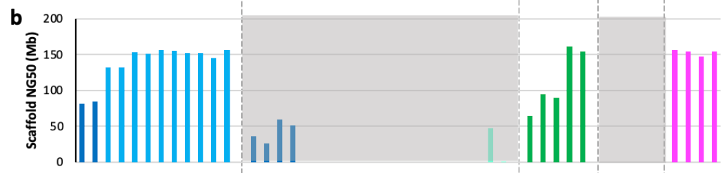
This result is pretty crazy: “All scaffolded assemblies had scaffold NG50 values ranging from 80-155 Mb, 52-100% of the theoretical maximum of 155 Mb.” This is good news for the HPRC, with long-read sequencing and the improvement in assembly algorithms—scaffold sizes are getting close to as long as they can be!
The last result that I’ll touch on is phasing performance. Phasing is the process of resolving the separate maternal and paternal copies of each chromosome:
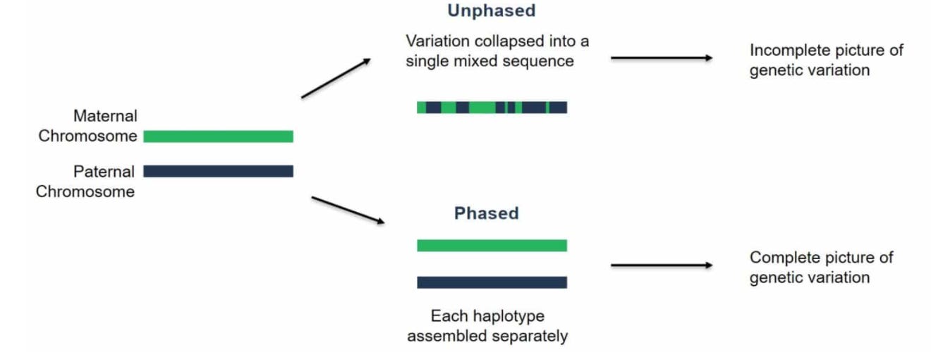
This is the key technical challenge that still needs to be addressed for automating diploid assembly.

Using the same NG50 metric, there are still respectable contig lengths for phased blocks in some of these automated assemblies—which is an exciting indicator for the feasibility of automated phasing at the scale that the HPRC will require. This is still an active area of methodological research.
Ultimately, this benchmarking effort helped to empirically determine which algorithmic ideas are the most accurate, and to identify shared sources of errors across all of the approaches. Despite the impressive quality of the automated assemblies, “There was no one approach, without using a highly curated reference … that was free of one or more scaffolding or contig errors in an automated process.”
This study provides crucial information about where the field of genome assembly is, and where it needs to go in order to make pangenomics a reality.
Final Thoughts
Completing the Human Genome Project was an enormous achievement that successfully established a new paradigm for biomedicine. Since then, progress in DNA sequencing and bioinformatics have propelled us into a world where it is possible to diagnose patients based on their genome in a matter of hours.
Genomic technology has progressed so considerably that we are now able to address one of the core biases in the field—which is that the overwhelming majority of analysis is carried out relative to a single reference genome. The HPRC is now hard at work pushing on the technological frontier in order to automate the process of assembling genomes, with the goal of making a comprehensive pangenomic reference.
This is not just an academic exercise. This type of technological progress has the potential to transform personal genomics—where individual genomes can be used to inform health decisions. It could move us closer to a world where all individuals could choose to have a de novo assembly of their own genome—where only two decades ago it took 10 years and $3 billion to create a single assembly!
Beyond human health, long-read sequencing and advanced assembly algorithms could greatly decrease the cost and time needed to broadly expand the category of biological organisms that we study. This could be an important paradigm shift for understanding the natural world and discovering amazing new biological technologies in the process.
Thanks for reading this highlight of “Automated assembly of high-quality diploid human reference genomes.” If you’ve enjoyed this post and don’t want to miss the next one, you can sign up to have them automatically delivered to your inbox:
Until next time! 🧬
Please tell me if I’m wrong! I’ve been looking for positive depictions of genetics in science fiction. Dystopian examples such as Gattaca, Jurassic Park, and Blade Runner are easy to find. If you are a science fiction buff and know some examples, I’d love to hear from you.
If you’re wondering what the 4 categories at the top of the plot are, they are different classifications of assembly approaches that the HPRC decided upon based on the submissions. They represent four levels of attempted completeness for assembling the reads into contigs, scaffolds, and doing phasing. More on these concepts soon!
The pangenome / variation graph figure (second one) is from a review paper: "Pangenome Graphs" https://doi.org/10.1146/annurev-genom-120219-080406. It describes the state of the art for pangenome data models as of several years ago. This specific figure shows three different visualizations of different parts of a gene in the human MHC class II. The colored bars show haplotypes assembled from the O.G. human reference genome project. Things have really changed with the new assembly data in the HPRC. We now have pangenome graph models of the entire MHC that include ~90 nearly complete assemblies! (like this http://hypervolu.me/~erik/MHC/mhc89/HPRCy1v2.MHC.fa.07df256.7748b33.fc0aea3.smooth.fix.og.viz_depth_multiqc.png)
How about the X Men series?